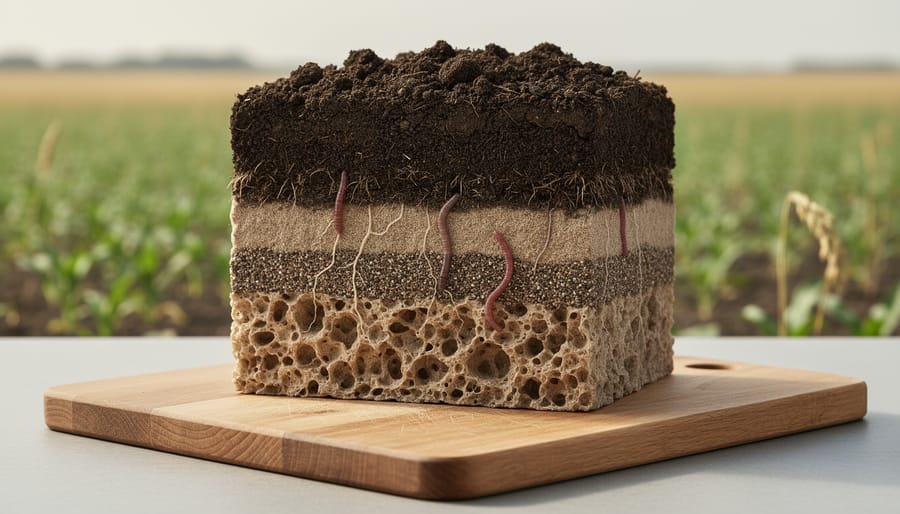
A soil health diagram is a visual tool that maps the biological, chemical, and physical properties of your soil to assess its overall quality and productivity. These diagrams transform complex lab results and field observations into clear, actionable snapshots, helping organic farmers identify strengths, spot deficiencies, and track improvements over time.
For Canadian growers managing organic systems, understanding what’s happening beneath the surface isn’t optional. Your soil is starving if you can’t measure what it needs. Soil health diagrams serve as diagnostic roadmaps, showing where organic matter sits, how water infiltrates, whether microbial life thrives, and if nutrient cycling keeps pace with crop demands. They consolidate data from aggregate stability tests, earthworm counts, infiltration rates, and organic carbon levels into formats you can actually use during planning season.
This article breaks down what soil health diagrams are, how they work as farm management tools, and the components they track. You’ll learn which diagram types suit different organic operations, from market gardens in Ontario to grain farms across the Prairies, and how to build your own using accessible field tests and lab analysis. We’ll also connect diagram insights to practical decisions, like adjusting cover crop species, timing compost applications, or managing tillage intensity to rebuild soil structure. Whether you’re transitioning to organic certification or fine-tuning a mature system, soil health diagrams turn abstract soil science into a management asset you can measure, monitor, and improve year after year.
What a Soil Health Diagram Shows
A soil health diagram is a visual representation that maps the multiple, interconnected factors determining whether your soil can support vigorous plant growth and long-term productivity. Unlike a simple nutrient test result or pH reading, these diagrams show how biological, physical, and chemical elements work together, or against each other, to create the living ecosystem beneath your feet.
Most diagrams organize soil health into distinct but overlapping categories, each influencing the others. When microbial populations thrive, for example, they improve soil structure, which in turn enhances water movement and nutrient availability. A diagram makes these relationships visible at a glance, helping you see patterns that individual test results might hide.
- Biological Activity
- The presence and function of organisms like bacteria, fungi, earthworms, and nematodes that break down organic matter and cycle nutrients.
- Soil Structure
- How soil particles bind together into aggregates, creating pore spaces that allow roots to penetrate and water to move through the profile.
- Organic Matter
- The decomposed plant and animal residues that feed soil life, hold moisture, and provide slow-release nutrients throughout the growing season.
- Nutrient Cycling
- The biological processes that convert nutrients from organic forms into plant-available forms, reducing the need for external inputs.
- Water Infiltration
- The rate at which water enters the soil surface and moves downward, affected by structure, compaction, and biological channels.
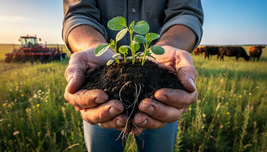
What makes these diagrams valuable for organic farmers is their ability to shift your perspective from soil as inert material to soil as a working biological system. You start asking different questions: not just “What nutrients am I missing?” but “Why aren’t nutrients cycling properly?” or “What’s limiting my soil biology?” This reframing leads directly to management decisions, adding compost to feed microbes, reducing tillage to preserve fungal networks, planting cover crops to build structure, that address root causes rather than symptoms.
How Soil Health Diagrams Work
The Visual Framework
Soil health diagrams translate scientific complexity into formats farmers can read at a glance. Most follow one of three common structures, each suited to different assessment needs.
Circular diagrams arrange indicators like spokes on a wheel, with soil health scores radiating from a center point. This format excels at showing balance, when all spokes reach similar lengths, the soil system functions well. Weak spots appear immediately as shorter spokes, signaling where organic interventions should focus.
Pyramid models stack foundational elements at the base (physical structure, water infiltration) and build toward biological indicators at the top. This hierarchy reflects how improvements in one layer support the next, connecting directly to soil vital processes that determine overall farm productivity.
Layered diagrams use horizontal bands to show depth profiles or temporal changes. Alberta farmers often prefer these for tracking how practices like reduced tillage affect compaction at different soil horizons, or how cover crops rebuild organic matter year over year.
Each format uses color coding, green for strong indicators, yellow for moderate concerns, red for immediate attention, making assessment results digestible during busy field seasons.
Connecting Observations to Action
Once you spot a weakness in your soil health diagram, say, low biological activity or poor aggregation, the diagram becomes your decision guide. Rather than applying every organic practice at once, you prioritize interventions where they’ll deliver the biggest return.
If your diagram flags declining microbial populations, that signals a need for carbon inputs. You might fast-track a winter rye cover crop or schedule fall compost spreading. Compacted zones showing up in the physical properties section? That’s your cue to reduce tillage passes next season or run deep-rooted crops like daikon radish to break up hardpan naturally.
Alberta farmers often face multiple constraints, short growing windows, equipment capacity, labour availability. The diagram helps you sequence improvements logically. Fix foundational issues like structure first, since better aggregation supports both biological activity and nutrient cycling. Address chemical imbalances second, then layer in biological enhancements.
This targeted approach prevents wasted effort and expense. You’re not guessing which organic technique to try next, you’re responding directly to what your soil is telling you through the diagram’s visual feedback.
Core Components in Soil Health Diagrams
Biological Indicators
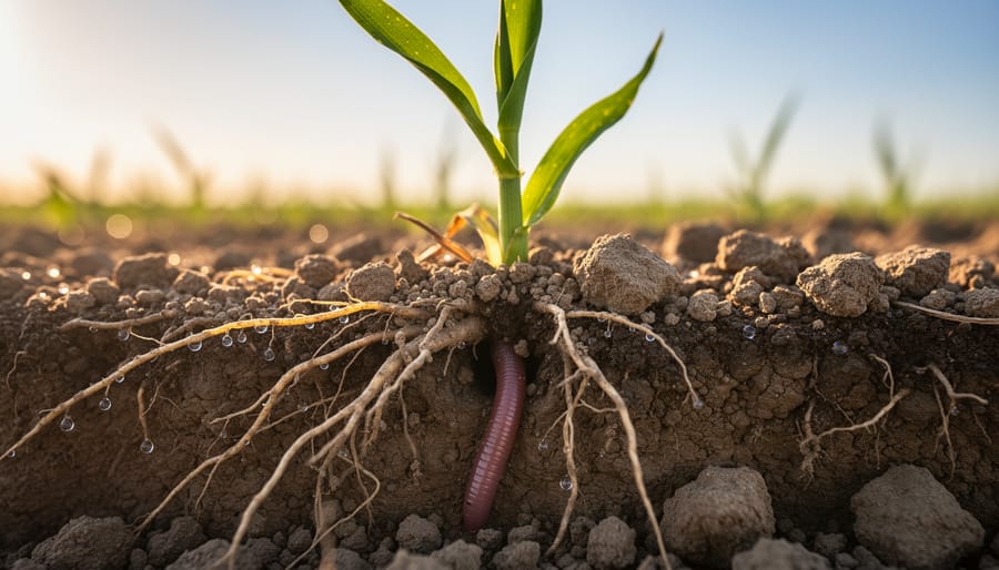
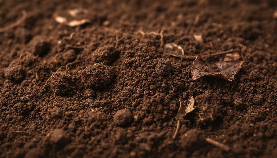
Biological indicators form the living heartbeat of any soil health diagram. Microbial activity, bacteria, fungi, protozoa, and other microscopic organisms, drives nutrient cycling by breaking down organic matter and making nutrients plant-available. Earthworm populations signal good soil structure and aeration; their burrows create channels for water infiltration and root penetration. Fungal networks, particularly mycorrhizae, extend root reach and improve nutrient uptake while binding soil particles into stable aggregates. In diagrams, these biological components often appear as interconnected elements showing how living organisms support both chemical balance and physical structure. Strong biological indicators typically correlate with resilient soils that resist compaction, retain moisture, and recover quickly from disturbance.
Physical Properties
Soil structure determines how easily roots penetrate and water moves through your fields. Well-aggregated soil forms stable crumbs that create pore spaces for air and moisture, you’ll see this reflected in diagrams as high structural quality. Compaction shows up as reduced pore space, limiting both root expansion and drainage.
Porosity measures the volume of air-filled and water-filled gaps in your soil. Healthy soil typically contains 50% pore space, split between large pores that drain quickly and small pores that hold moisture for plants. When diagrams indicate poor physical properties, you’re likely seeing shallow rooting, waterlogging after rain, or rapid drying during drought, all signs that structure needs rebuilding through reduced tillage and organic matter inputs.
Chemical Balance
The chemical dimension of soil health captures how effectively your soil can hold and release nutrients to crops. pH sits at the centre of this picture, most organic vegetables and grains thrive between 6.0 and 7.0, where nutrients remain available rather than locked up. Cation exchange capacity (CEC) measures your soil’s ability to retain positively charged nutrients like calcium, magnesium, and potassium; higher organic matter boosts CEC, turning soil into a nutrient reservoir rather than a leaky sieve. Diagrams often display organic matter percentage as a chemical indicator because it directly governs nutrient release timing and microbial activity. When these chemical factors balance well, plants access what they need without heavy inputs, a cornerstone of successful organic systems.
Management Impact Zone
The management impact zone in a soil health diagram illustrates the direct connection between your farming decisions and measurable soil outcomes. This component typically appears as an outer ring or overlay that highlights how specific practices influence the biological, physical, and chemical indicators at the diagram’s core.
In organic systems, this zone captures the cumulative effect of techniques like crop rotation, cover cropping, and reduced tillage. When you implement a diverse four-year rotation, for instance, the diagram shows corresponding improvements in microbial diversity and nutrient cycling capacity. Similarly, minimizing soil disturbance preserves fungal networks and aggregate stability, changes that become visible in updated assessments.
Alberta farmers often use this zone to compare management strategies across fields. A paddock under long-term organic management will show stronger scores across multiple indicators compared to recently transitioned land, helping you quantify the return on your soil-building investments.
The management impact zone transforms abstract practices into concrete visual feedback. It answers the question every farmer asks: “Is what I’m doing actually working?” By tracking how your organic techniques shift the diagram over seasons, you gain confidence in your approach and identify which practices deliver the greatest soil health gains on your specific land.
How Canadian Farmers Use Soil Health Diagrams
Baseline Assessment and Goal Setting
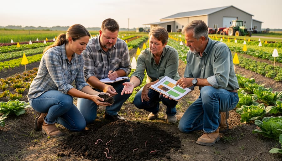
Starting with a soil health diagram means capturing where your farm stands today, not where you hope it’ll be or where your neighbour’s fields are. Conduct initial assessments in early spring or late fall when you can access representative field areas without damaging crops. Sample multiple zones: your best-performing fields, problem areas, and transition ground. Record biological indicators like earthworm counts per spade-full, physical properties such as aggregate stability, and chemical markers including pH and organic matter percentage.
Plot these baseline measurements on your chosen diagram format. The resulting visual immediately reveals strengths to maintain and weaknesses requiring attention. Most Alberta organic farms find biological activity scores lower than desired after conventional transitions, while chemical balance often improves faster.
Set specific, measurable targets for the next three to five years. Instead of vague goals like “better soil,” aim for concrete improvements: increase earthworm populations from 8 to 15 per sample, raise organic matter from 3.2% to 4.5%, or improve aggregate stability scores by two points. These targets should reflect your certification requirements, crop rotations, and realistic timelines for organic amendments to show effect in Prairie conditions.
Seasonal Monitoring and Adjustments
Alberta’s short growing season and unpredictable precipitation make timing critical for organic farmers. Soil health diagrams transform into dynamic tracking tools when you assess them at consistent intervals, typically in early spring before planting, mid-season during peak growth, and after harvest. Each snapshot captures how your soil responds to management decisions and weather patterns throughout the year.
Spring assessments reveal how well your soil recovered over winter. Check aggregate stability after snowmelt and before working the land, compacted zones show up clearly when soil is at field capacity. Mid-season evaluations track biological activity during the growing window, when microbial populations peak and nutrient cycling accelerates. Post-harvest diagrams document the cumulative effect of the season’s practices, showing whether cover crops, compost applications, or reduced tillage moved indicators in the desired direction.
Alberta’s variable precipitation demands flexible responses. A wet spring might delay cover crop termination, affecting the nitrogen availability shown in your diagram’s chemical balance section. Drought conditions reduce earthworm activity and slow organic matter decomposition, biological indicators that signal the need for moisture-conserving practices like mulching or adjusting your organic management plan. By comparing seasonal diagrams side-by-side, you identify which practices deliver results despite climate challenges and which need modification for your specific conditions.
Organic Management Techniques That Improve Diagram Scores
Cover Cropping and Green Manures
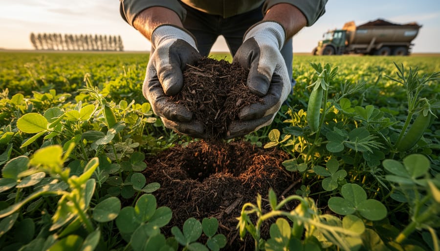
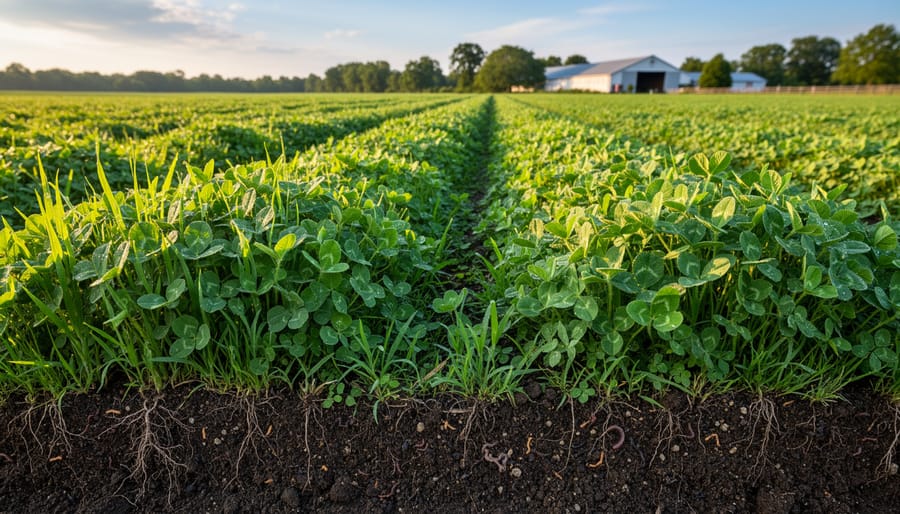
Cover crops and green manures deliver measurable improvements to the biological and organic matter indicators that sit at the core of most soil health diagrams. When you seed a diverse mix, say oats, peas, radishes, and clover, you’re feeding different microbial communities simultaneously. Each plant species exudes unique root compounds, attracting distinct bacteria and fungi that colonize the rhizosphere and build the underground networks your diagram tracks.
The biological boost shows up quickly. A well-chosen cover crop mix can double earthworm populations within a single season and increase microbial biomass by 30 to 50 percent compared to bare soil. Green manures terminated before flowering channel all that plant tissue back into the soil, providing fresh organic matter that decomposers convert into stable humus. This directly lifts the organic matter percentage you’re monitoring in your diagram’s chemical balance section.
For Alberta’s short growing window, focus on fast-establishing mixes seeded immediately after harvest. Winter-killed varieties like oats and radishes eliminate spring termination work while still delivering root biomass and soil coverage that protect biological activity through freeze-thaw cycles.
Compost and Organic Amendments
Quality compost transforms the biological and chemical zones of a soil health diagram more dramatically than almost any other organic input. When you incorporate well-aged compost into your fields, microbial populations explode, bacteria, fungi, and protozoa colonize the fresh organic matter, creating the vibrant biological activity that pushes diagram scores upward. This microbial boom drives nutrient cycling, converting locked-up nutrients into plant-available forms and boosting the chemical balance indicators on your diagram.
Compost also rebuilds soil structure. As microbes consume organic matter, they excrete sticky compounds that glue soil particles into stable aggregates, the physical property that prevents compaction and improves water infiltration. Alberta farmers working heavy clay soils see particularly strong improvements in the physical properties section of their diagrams after consistent compost applications.
The key is quality. Finished compost that’s reached 60°C during the hot phase delivers diverse microbial inoculants. Half-finished material or poorly managed compost can tie up nitrogen temporarily, creating a dip in your diagram’s nutrient availability score before the long-term benefits appear.
Reduced Tillage Approaches
Reduced tillage preserves the underground architecture that healthy soil depends on. When you limit mechanical disturbance, fungal networks remain intact, earthworm tunnels stay open, and beneficial microbes continue their work undisturbed. These changes show up clearly in soil health diagrams, particularly in biological indicators and physical structure scores.
Reduced tillage approaches range from strategic strip-tillage for planting zones to complete no-till systems using tarps and minimal disturbance seeders. Alberta farmers often start by reducing tillage depth and frequency rather than eliminating it entirely. Even modest reductions protect soil aggregates and maintain the pore spaces that improve water infiltration and root penetration.
Soil health diagrams reflect these improvements through higher aggregate stability scores and increased biological activity readings. You’ll typically see measurable changes within two to three growing seasons as microbial populations stabilize and physical structure improves. The visual feedback helps justify the transition period when yields might temporarily dip as soil biology rebuilds.
Creating and Customizing Your Farm’s Soil Health Diagram
Creating a personalized soil health diagram starts with identifying which indicators matter most for your operation. Rather than tracking every possible metric, focus on three to five key components that align with your farming goals and current challenges. An Alberta grain farmer dealing with compaction might prioritize aggregate stability and penetration resistance, while a vegetable grower could emphasize microbial activity and nutrient availability.
Begin by gathering baseline data through simple field tests and observations. You don’t need expensive lab analysis for every parameter. Start with visual assessments like the slake test for aggregate stability, earthworm counts in representative areas, and basic texture evaluation. Combine these with affordable soil tests for pH, organic matter percentage, and major nutrients. Record these measurements during the same season each year to ensure consistent comparisons.
Choose a visual format that makes sense for your brain. Some farmers prefer circular diagrams with each indicator as a spoke radiating from the center, while others find bar charts or spider graphs clearer. The shape matters less than consistency, stick with one format so you can easily spot changes over time.
Set realistic target ranges for each indicator based on your soil type and climate. A sandy Alberta soil won’t match the organic matter levels of prairie loam, and that’s fine. Your diagram should show improvement relative to your starting point, not abstract ideals. Mark your current status in one colour and your goals in another.
Update your diagram annually after harvest, before planning next season’s interventions. This timing captures the cumulative effect of your management practices. Keep physical copies in your farm records for organic certification audits, these diagrams demonstrate your commitment to soil stewardship and provide visual evidence of continuous improvement that inspectors appreciate.
Most importantly, share your diagram with family members, employees, or business partners who make field decisions. A simple visual beats lengthy explanations when everyone needs to understand soil health priorities.
Common Questions About Soil Health Diagrams
How often should I update my farm’s soil health diagram?
Most organic farmers update their diagrams annually, typically after harvest when they can reflect on the full season’s outcomes. If you’re implementing new practices like cover cropping or transitioning fields, consider updating twice yearly to track rapid changes during the establishment phase.
Do I need professional soil testing to create a diagram?
No, you can start with visual assessments and simple on-farm tests like the slake test or earthworm counts. Professional lab testing adds precision for chemical indicators, but many successful diagrams begin with farmer observations and field measurements that cost nothing.
Will using soil health diagrams help with organic certification?
While diagrams themselves aren’t required for certification, they document your soil fertility management practices and demonstrate continuous improvement, both valued by certifiers. They provide clear evidence of your organic system plan in action.
What’s the typical cost to implement a diagram system?
Starting costs can be zero if you use observation-based assessments and free templates. Adding lab testing for baseline measurements might run $50-150 per sample, but many farmers test only key fields initially and expand their monitoring program as benefits become clear.
The flexibility of soil health diagrams makes them accessible regardless of farm size or budget. You’re not locked into expensive monitoring programs or complicated software. A hand-drawn diagram updated in a notebook works just as well as a digital version if it helps you make better decisions about compost timing, cover crop selection, or tillage intensity.
Many Alberta farmers start simple, tracking just three or four indicators they can measure themselves, then gradually add complexity as they see patterns emerge. The diagram grows with your understanding of your soil, becoming more refined as you learn which indicators matter most for your specific crops and conditions.
Soil health diagrams transform abstract soil science into something you can see, discuss, and act on. For organic farmers across Alberta and Canada, these visual tools cut through complexity and make soil biology, chemistry, and structure understandable at a glance. Whether you’re explaining your management approach to a certification inspector, securing financing for organic transition, or simply tracking your own progress year over year, a well-designed diagram tells the story your soil data alone cannot.
You don’t need sophisticated software or laboratory-perfect measurements to start. Begin with the basics: sketch out what you know about your soil’s biological activity, physical structure, and nutrient balance. Mark where you excel and where improvement is needed. As seasons pass and your organic practices take hold, update the diagram. You’ll watch biological indicators strengthen as cover crops build microbial communities. Physical properties will improve as reduced tillage preserves soil structure. Chemical balance will stabilize through thoughtful compost application and diverse rotations.
The real power isn’t in creating the perfect diagram on your first attempt. It’s in the ongoing conversation these visuals create between you and your land. They help you notice what’s changing, celebrate what’s working, and adjust what isn’t delivering results. Start simple, stay consistent with your assessments, and let the diagram grow more detailed as your understanding deepens. Your soil has been waiting for this kind of attention.